Goals
Hometap is a fintech company whose goal is to make homeownership less stressful. Their core product is a home equity investment, which is an alternative to a HELOC and gives homeowners the ability to “tap into” into their home equity without monthly payments.
Due to a recent rebrand, the team had the opportunity to align existing components to the new visual direction, starting with the most high-impact components.
Deliverables
-
Design tokens
Worked alongside developers to assign semantic tokens for color as well as border-radius and spacing.
Cross-functional alignment gave much more consistency to the product and guardrails for the design team. This also made for easy theming.

-
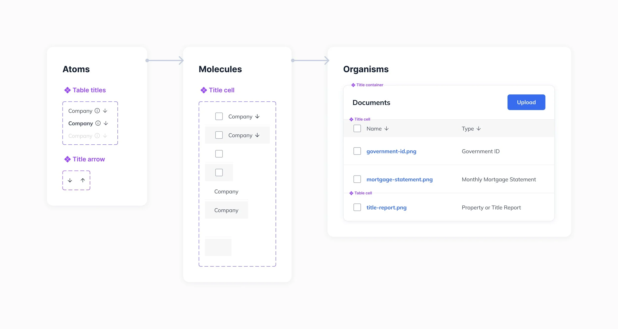
Component library
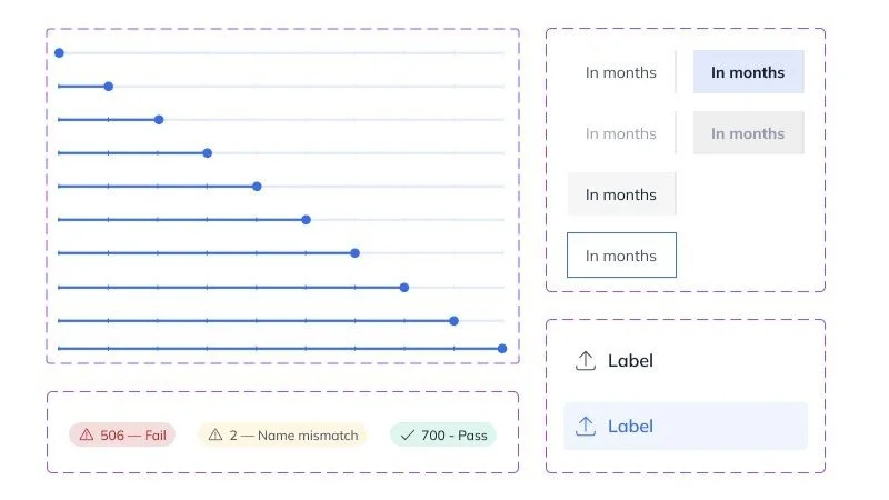
Starting with the components that had the highest impact across products, we redesigned these according to WCAG accessibility guidelines, adding in states and size variants that allowed for greater flexibility.

-
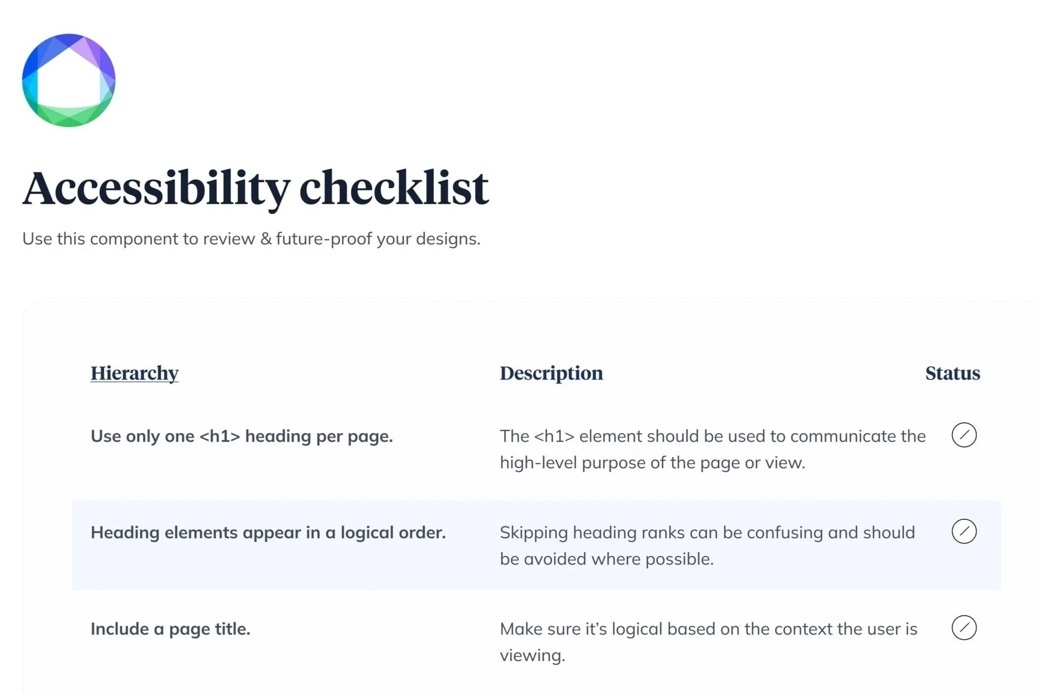
Accessibility rules
We came up with a list of accessibility guidelines that both QA, design, and development had shared responsibility for owning. This enabled us to cut out a third-party auditor and craft components with longevity and flexibility in mind.


